Flattening the curve and the third derivative
Caveat lector: I am not an expert on epidemiology, mathematical biology, or even applied mathematics in general. I am a pure mathematician, but I am also a math teacher, and at the undergraduate level that often means teaching calculus. It is that experience which informs the thoughts below.
There is an anecdote that sometimes gets told in freshman calculus classes which I'll call "Richard Nixon and the third derivative". It goes something like this: While running for re-election in 1972, President Nixon sought to reassure the nation by announcing that the “rate of increase of inflation was decreasing”.
To understand the context of this story in the classroom, it’s worth knowing a little bit about differential calculus, the mathematical study of rates of change.
Suppose you have a quantity which changes over time. The rate at which that quantity changes is called its derivative. For example, if the original quantity describes the distance an object has traveled from its starting point, its derivative describes the velocity of that object at any moment in time. The rate at which the derivative changes, the derivative of the derivative, is the second derivative of the original quantity. In the previous example, the second derivative, the rate at which velocity changes, is the object's acceleration. Likewise, one can define the third derivative, fourth derivative, and so on.
Visually, if we sketch the graph of a quantity changing over time, with the value of the quantity represented by the height of the graph, and time increasing from left to right, the derivative corresponds to the slope (steep or shallow, upwards or downwards) of the graph at a given time. The second derivative describes the change in the slope, whether it becomes more or less upwards or downwards sloping.
The above story about the 37th President of the United States might get brought up in calculus class after introducing the first, second, and higher-order derivatives, perhaps in response to a question from a student like “so what’s the third derivative good for?”
Inflation is itself a derivative, it’s a measure of the rate of change of prices over time. Whether inflation is increasing or decreasing is measured by its rate of change, the second derivative of price, and so the rate of increase of inflation is given by the third derivative of price.
The usual lesson that gets attached to this story is that it is an example of using of mathematics to mislead or misdirect; it is entirely possible that both prices and inflation are increasing, despite the rate of increase decreasing. The implication is that, during the inflation crisis of the 1970’s, and his hard-fought presidential campaign, it took three derivatives for Tricky Dick to find something positive (or in this case, negative) to say.
But you are likely reading this sometime in the middle of 2020, when talk of “rates of increase decreasing” probably evokes a far more troubling and current crisis than Nixon-era inflation.
“The rate of increase is slowing. But the number of cases are still going up.” - Andrew Cuomo, Governor of New York, March 27, 2020.
In this quote, Governor Cuomo is referring to the rate of increase of the number of COVID-19 cases in New York State, in late March of 2020. At that point in time, as New York was quickly becoming the epicenter of the pandemic in the United States, these words were reassuring. Something was going down, finally, even though the total number of cases, and number of new cases every day, were still increasing in alarming ways. And why was this reassuring? Because it suggested that the curve was beginning to flatten.
Throughout the pandemic, we have been inundated by graphs, curves, and charts, increasing and decreasing, steeper and flatter. The call to “flatten the curve” has been as much a hallmark of this moment as wearing masks while grocery shopping and telling friends and family to “stay safe” at the end of video calls.
A common visual during the early days of the pandemic in the United States was of two hump-like curves, one steeper and taller, peaking earlier, and another flatter, with apex later on. The height of these curves is usually labelled as “number of cases” or “number of infections”, though it should it really be labelled as “number of new cases per day”. Moving from left to right indicates the number of days since the first case.
These curves represent the derivative of the total number of cases in two different scenarios, the former with less preventative measures and the latter with more. The height of each curve on a given day represents the increase, or daily rate of change, in the total number of cases on that day. The total number of cases up to a given day corresponds to adding up all of the daily rates of change from day 1 to the day in question, and thus equals the area under the curve (that the area under the derivative of a quantity equals the original quantity itself is exactly the Fundamental Theorem of Calculus).
Whether these curves are going upwards, with numbers of daily cases increasing, or downwards, with numbers of daily cases decreasing, is indicated by the sign (negative or positive) of their derivatives, the second derivatives of the total number of cases. And, crucially, whether these curves are actively flattening, experiencing an inflection point as they go from increasing rapidly to more slowly, is indicated by a change in sign of their second derivatives, or the third derivative of the total number of cases.
All of this is to say, the third derivative has never felt so important.
To further illustrate this, consider the phenomena of exponential growth. A quantity grows exponentially if its rate of change, that is, its derivative, is proportional to the quantity itself, for example, if it doubles every day. One of the standard facts learned in calculus and differential equations is that such a quantity must then, necessarily, be of a particular form. What matters here is what the graphs of such quantities look like and how their derivatives behave:
A quantity undergoing exponential growth slopes ever upwards; since the quantity is going up, the slope, being proportional to the quantity, increases, resulting in a steeper and steeper graph, causing the quantity to go up even more. This is the harrowing nature of exponential growth, a miracle when it happens to your retirement savings, a serious problem when it happens to your credit card debt, both through the effects of compound interest, and a public health crisis when happening to the number of infections during the initial stages of a viral outbreak.
Since the derivative of a quantity undergoing exponential growth is proportional to the original quantity, so is the second derivative, and the third derivative, and so on. In particular, all of the higher-order derivatives are positive and increasing.
In closed systems, exponential growth cannot last. A double-or-nothing strategy at the poker table eventually bankrupts either you or the house, and a natural organism, such as a virus, doubling every few days eventually hits up against its carrying capacity, the natural limit of its extent imposed by environmental conditions. The simplest model of the latter situation is logistic growth; an initial rapid exponential rise in the total quantity, then flattening over time, with its first derivative giving the now familiar “hump” pattern.
Logistic growth is based on a fixed carrying capacity in the environment, whereas in the case of a virus, infections often lead to immunity, causing a dynamic change in environmental conditions. This is captured in more sophisticated models, like the SIR (for susceptible, infected, and recovered) model. (It must be stressed that, in the case of COVID-19, the current understanding of how much immunity is granted by infection and recovery is still limited.)
When it comes to a virus which has the potential to kill or harm millions, we don’t want it to get anywhere near its carrying capacity, and relying on infection-based immunity alone (the so-called herd immunity strategy) carries with it the prospect of a terrifying amount of death. This is why we, as a global society, have taken so many dramatic actions in the past three months, like social distancing, curbing travel, closing businesses, and wearing masks. By reducing the ability of the virus to spread, through these deliberate actions, we are in effect decreasing the higher-order derivatives of the total number of cases, with the goal of flattening the infection rate and ultimately halting the growth of the total number of cases as the world waits for a vaccine or other treatment.
The particular importance of the third derivative of the total number of cases is that it provides a clear measure of the flattening; even as the number of daily cases increases, a slowing of that increase, and a flattening of the curve, is characterized by this third derivative becoming negative.
All of this only applies to the upwards sloping part of the curve of new daily cases. Once we reach the apex, the flattened top of the curve, we will begin, hopefully, to trend downwards, initially slowly, then more rapidly, until flattening off again at a minimal level of new infection. During this phase, the third derivative of the total number of cases will begin to increase, a good sign, becoming positive during the time of steepest decline, and then zeroing out as the curve of new cases flattens near zero, and the total number of cases stabilizes. This best-case scenario depends on our continued vigilance in our preventative measures.
One day, in the not so distant future, I’ll be teaching calculus again. Whether it will be online, to a crowd of a faces in virtual boxes, or in a socially distant classroom, I cannot say. But I do know that if someone asks me what the third derivative is good for, I have a new, better, and more urgent answer.
Thanks to Smaranda Sandu for reading an earlier version of this post and providing helpful comments.
There is an anecdote that sometimes gets told in freshman calculus classes which I'll call "Richard Nixon and the third derivative". It goes something like this: While running for re-election in 1972, President Nixon sought to reassure the nation by announcing that the “rate of increase of inflation was decreasing”.
To understand the context of this story in the classroom, it’s worth knowing a little bit about differential calculus, the mathematical study of rates of change.
Suppose you have a quantity which changes over time. The rate at which that quantity changes is called its derivative. For example, if the original quantity describes the distance an object has traveled from its starting point, its derivative describes the velocity of that object at any moment in time. The rate at which the derivative changes, the derivative of the derivative, is the second derivative of the original quantity. In the previous example, the second derivative, the rate at which velocity changes, is the object's acceleration. Likewise, one can define the third derivative, fourth derivative, and so on.
Visually, if we sketch the graph of a quantity changing over time, with the value of the quantity represented by the height of the graph, and time increasing from left to right, the derivative corresponds to the slope (steep or shallow, upwards or downwards) of the graph at a given time. The second derivative describes the change in the slope, whether it becomes more or less upwards or downwards sloping.
 |
| Figure 1: The red curve represents the distance from the ground of an object in free fall. The object’s velocity, the derivative of distance, is the blue curve; notice that it is negative and decreasing since the object is going downwards. The object’s acceleration, the second derivative of distance, is given by the green curve; it is constant since the force of gravity is constant. (Created using Desmos: https://www.desmos.com/calculator/jtecnxvsik) |
Inflation is itself a derivative, it’s a measure of the rate of change of prices over time. Whether inflation is increasing or decreasing is measured by its rate of change, the second derivative of price, and so the rate of increase of inflation is given by the third derivative of price.
The usual lesson that gets attached to this story is that it is an example of using of mathematics to mislead or misdirect; it is entirely possible that both prices and inflation are increasing, despite the rate of increase decreasing. The implication is that, during the inflation crisis of the 1970’s, and his hard-fought presidential campaign, it took three derivatives for Tricky Dick to find something positive (or in this case, negative) to say.
But you are likely reading this sometime in the middle of 2020, when talk of “rates of increase decreasing” probably evokes a far more troubling and current crisis than Nixon-era inflation.
“The rate of increase is slowing. But the number of cases are still going up.” - Andrew Cuomo, Governor of New York, March 27, 2020.
In this quote, Governor Cuomo is referring to the rate of increase of the number of COVID-19 cases in New York State, in late March of 2020. At that point in time, as New York was quickly becoming the epicenter of the pandemic in the United States, these words were reassuring. Something was going down, finally, even though the total number of cases, and number of new cases every day, were still increasing in alarming ways. And why was this reassuring? Because it suggested that the curve was beginning to flatten.
Throughout the pandemic, we have been inundated by graphs, curves, and charts, increasing and decreasing, steeper and flatter. The call to “flatten the curve” has been as much a hallmark of this moment as wearing masks while grocery shopping and telling friends and family to “stay safe” at the end of video calls.
A common visual during the early days of the pandemic in the United States was of two hump-like curves, one steeper and taller, peaking earlier, and another flatter, with apex later on. The height of these curves is usually labelled as “number of cases” or “number of infections”, though it should it really be labelled as “number of new cases per day”. Moving from left to right indicates the number of days since the first case.
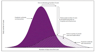 |
| Figure 2: Taken from "Community Mitigation Guidelines to Prevent Pandemic Influenza — United States, 2017" (https://www.cdc.gov/mmwr/volumes/66/rr/rr6601a1.htm) |
These curves represent the derivative of the total number of cases in two different scenarios, the former with less preventative measures and the latter with more. The height of each curve on a given day represents the increase, or daily rate of change, in the total number of cases on that day. The total number of cases up to a given day corresponds to adding up all of the daily rates of change from day 1 to the day in question, and thus equals the area under the curve (that the area under the derivative of a quantity equals the original quantity itself is exactly the Fundamental Theorem of Calculus).
Whether these curves are going upwards, with numbers of daily cases increasing, or downwards, with numbers of daily cases decreasing, is indicated by the sign (negative or positive) of their derivatives, the second derivatives of the total number of cases. And, crucially, whether these curves are actively flattening, experiencing an inflection point as they go from increasing rapidly to more slowly, is indicated by a change in sign of their second derivatives, or the third derivative of the total number of cases.
All of this is to say, the third derivative has never felt so important.
To further illustrate this, consider the phenomena of exponential growth. A quantity grows exponentially if its rate of change, that is, its derivative, is proportional to the quantity itself, for example, if it doubles every day. One of the standard facts learned in calculus and differential equations is that such a quantity must then, necessarily, be of a particular form. What matters here is what the graphs of such quantities look like and how their derivatives behave:
 |
| Figure 3: The red curve represents some quantity undergoing exponential growth, in this case doubling with every unit change in time, the blue curve its first derivative, the green curve its second derivative, and the purple curve its third derivative. (Created using Desmos: https://www.desmos.com/calculator/jfxc4mx3xk) |
A quantity undergoing exponential growth slopes ever upwards; since the quantity is going up, the slope, being proportional to the quantity, increases, resulting in a steeper and steeper graph, causing the quantity to go up even more. This is the harrowing nature of exponential growth, a miracle when it happens to your retirement savings, a serious problem when it happens to your credit card debt, both through the effects of compound interest, and a public health crisis when happening to the number of infections during the initial stages of a viral outbreak.
Since the derivative of a quantity undergoing exponential growth is proportional to the original quantity, so is the second derivative, and the third derivative, and so on. In particular, all of the higher-order derivatives are positive and increasing.
In closed systems, exponential growth cannot last. A double-or-nothing strategy at the poker table eventually bankrupts either you or the house, and a natural organism, such as a virus, doubling every few days eventually hits up against its carrying capacity, the natural limit of its extent imposed by environmental conditions. The simplest model of the latter situation is logistic growth; an initial rapid exponential rise in the total quantity, then flattening over time, with its first derivative giving the now familiar “hump” pattern.
 |
| Figure 4: The red curve represents some quantity undergoing logistic growth, the blue curve its first derivative, the rate of change in the original quantity, the green curve its second derivative, and the purple curve its third derivative. Notice how the third derivative becomes negative as the first derivative flattens. (Created using Desmos: https://www.desmos.com/calculator/uim3mikoh5) |
Logistic growth is based on a fixed carrying capacity in the environment, whereas in the case of a virus, infections often lead to immunity, causing a dynamic change in environmental conditions. This is captured in more sophisticated models, like the SIR (for susceptible, infected, and recovered) model. (It must be stressed that, in the case of COVID-19, the current understanding of how much immunity is granted by infection and recovery is still limited.)
When it comes to a virus which has the potential to kill or harm millions, we don’t want it to get anywhere near its carrying capacity, and relying on infection-based immunity alone (the so-called herd immunity strategy) carries with it the prospect of a terrifying amount of death. This is why we, as a global society, have taken so many dramatic actions in the past three months, like social distancing, curbing travel, closing businesses, and wearing masks. By reducing the ability of the virus to spread, through these deliberate actions, we are in effect decreasing the higher-order derivatives of the total number of cases, with the goal of flattening the infection rate and ultimately halting the growth of the total number of cases as the world waits for a vaccine or other treatment.
The particular importance of the third derivative of the total number of cases is that it provides a clear measure of the flattening; even as the number of daily cases increases, a slowing of that increase, and a flattening of the curve, is characterized by this third derivative becoming negative.
All of this only applies to the upwards sloping part of the curve of new daily cases. Once we reach the apex, the flattened top of the curve, we will begin, hopefully, to trend downwards, initially slowly, then more rapidly, until flattening off again at a minimal level of new infection. During this phase, the third derivative of the total number of cases will begin to increase, a good sign, becoming positive during the time of steepest decline, and then zeroing out as the curve of new cases flattens near zero, and the total number of cases stabilizes. This best-case scenario depends on our continued vigilance in our preventative measures.
One day, in the not so distant future, I’ll be teaching calculus again. Whether it will be online, to a crowd of a faces in virtual boxes, or in a socially distant classroom, I cannot say. But I do know that if someone asks me what the third derivative is good for, I have a new, better, and more urgent answer.
Thanks to Smaranda Sandu for reading an earlier version of this post and providing helpful comments.

Comments
Post a Comment